
Doers
A TIME FOCUS SOCIAL APP
ROLE: UX, UI, INTERACTION DESIGN
DURATION: 6 MONTHS

OVERVIEW
Doers is an app that increase individual’s efficiency, reduce the distraction by technology and more focus on the work at hand. By getting motivation from friends or peers in leaderboard and groups, people could be more self-discipline from competing and monitoring with others.
The Problem:
People are incredibly distracted by their technological devices and it is having negative impacts. Technology has given us a great many ways to stay connected with colleagues and friends. But the demands of that connection cause time and focus to be lost to the detriment of employment and socialization.
The Goal:
Find a solution to help individuals in their controllable time to reduce technology distraction and be more focus through the motivation which transit from the distraction
My Role:
Research, Ideation, Concept Testing, Information Architecture, User Flows, Wireframes, Usability Testing, UI Design, Final Prototype
Team: Shuo Dang, Briannon Schaeffer, Eric Campell
DESIGN PROCESS
→
Define
User Persona Journey Mapping Insight Analysis
→
Ideate
How Might We
Rapid Ideation
Concept Testing
→
Prototype
Site Maps
User Flows
Wireframes
→
Test
Usability Test
UI Design
Final Prototype
→
Empathize
Primary Research User Interviews Secondary Research
Empathize
Distraction by technology exists in our daily life and its impacts become more negative. People rely on checking their phone, wasting time on it, but there is a large disparity of attitudes about how to deal with this distraction.We need a better understanding of the problems and issues that individuals how to react when get distracted by smart devices. To accomplish this, we began by conducting primary and secondary research and analysis.
Primary Research: Our group chose to conduct audience interviews for our primary research method to gather information on user’s feelings, motivations, behaviors and routines around distraction by technology. We started our research phase with one-on-one interviews lasting between 45 minutes to 1.5 hours. Over the span of two weeks, our team interviewed 15 individuals ranging in age from early 20’s to over 50.
15
Interview Participants
20
Questions Per Participant
300
Individual Data Points
Secondary Research: We focused our secondary research on three main areas of analysis, topics included: Being distracted by notifications, wasting time on checking smart device and losing attention for a certain time. Each group member took one of the three areas of analysis to research
Analysis: Utilizing a shared research Notebook, virtual sticky notes, and the platform Mural, our group was able to effectively organize and analyze our data. Using the method of affinity mapping to uncover themes from participant interviews, we came to understand that individuals had feelings of stress and anxiety on wasting time when interrupting focus by technology distractions no matter actively or passively.
DEFINE
PERSONAS & JOURNEY MAPPING
Based on our research findings, we created user personas and journey maps to help provide us with a better understanding of our users. This step helped us visualize what our users’ goals were, motivations for using the app, pain points, personalities, behavior, and tasks they want to achieve. At this point, we had identified two personas that were to become our target audience.

The task-oriented individual prioritizes staying focused so they can complete tasks in an orderly fashion. They experience anxiety and lose their train of thought when outside distractions confront them. They prefer to limit being distracted by technology as much as possible. An example would be a programmer to whom flow is a precious state of mind.
The multi-tasker who needs to evaluate certain subsets of notifications eg to determine if they are important enough to jump the priority queue, actionable, or if it can wait. They regard distraction as a part of their life which cannot be ignored. The important thing is to prioritize their tasks, to manage the time, to live and work efficiently. An example would be a manage who needs to act upon inputs from colleagues.
IDEATE
As we developed a better understanding of the problem landscape as identified by our audience, we began coming up with several solutions through the process of rapid ideation. We used comparative matrices to identify potential products and value propositions to define our product goals.
Matrix Brainstorm
Guided by our user journeys and personas we used a matrix brainstorm activity to ask a series of “How Might We” questions.
Value Propositions
Once we had an initial set of product concepts, we organized and narrowed them down to the most viable solutions by running each product idea through a value proposition exercise.

CONCEPT TESTING
Once we solidified our initial concepts, we tested our four MVP’s, running users through scenarios and concepts to validate which solutions were most likely to solve the user’s problems and to see which concepts and features were most valued.
Primary Research
We conducted 5 rounds of concept testing with different users to collect qualitative feedback.
Post Interview Survey
Following the concept test study, each participant completed a survey
Gather quantitative data
Understand which features were the most important to users
Understand communication and user engagement preferences
Initial pain points that existed with each concept


KEY FINDINGS

Friends Activities
People think viewing friends’ time distribution would help them to focus their work better while others not. They lile to see friends’ activities to get motivated, but few people not due to the privacy concern
Distraction Types
The notification icons with numbers and audible beeps or vibrations were the most common type of distractions

Clear Value Proposition
Not a lot of people understood or sympathized with the scenario that one of the apps was built around, making them unlikely to choose it even though the use case was clearly defined
Gamification
Gamification or rewards accountable system would add some fun elements when friends working together to get more motivated


Notification Control
People really wanted to be able to block notifications entirely. The concept built around managing notifications rather than full suppression was the least popular

Audio Categories
People liked the ability to pick which type of audio they would listen to in an organized layout
PROTOTYPE
INTRODUCING ‘Doers’
“Doers represents kind of people who dedicate on their work at hand with concentration and focus on time purposely. Or people who want to reduce distraction and boost their efficiency. “
Doers is an app that change individuals’ relation with distraction by technology. The purpose of this app is to provide an a social platform for people who want to focus time together and get motivated from each other.


INFORMATION ARCHITECTURE
After research and analysis review, I began to think through the information architecture. To help with this part, I recruited 12 users and conducted an open card sort online using Optimal Workshop.
Card Sort
Since I conducted the card sort online, I wasn’t able to gather direct feedback from participants as they completed the sort. This is something that I would like to do for future card sorts, as in person feedback likely would have yielded deeper insights.
Site Map
Keeping the card sort results in mind, I developed a site map that would allow for users to navigate the app easily.
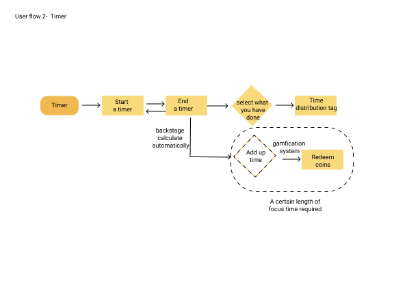
User Flows
To test the validity of the site map, I designed 4 user flows for the following interactions to be tested: Sign-in, Timer, Friends leaderboard and Group.

Wireframe

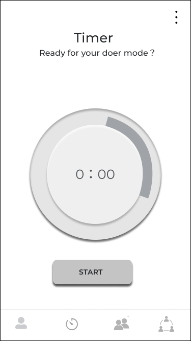
Using Figma to create low-fidelity wireframes based on early design sketches. This allowed me to visually determine how best to present my content based on concept testing feedback and my user’s needs.
I created four parts of the app, your home profile page, timer page, friends leaderboard page, and groups page. These pictures indicate the main feature s of these four pages.
Wire-framing allowed me to quickly create the first iteration of my app for usability testing, giving users something to physically interact with to test/validate my initial designs.


TEST
USABILITY TESTING
After creating my low-fidelity prototype in Figma, I was able to conduct usability testing with 8 individuals who fit my target personas. Due to Covid, I completed usability testing virtually over the course of two weeks using Zoom. Participants were aged between 25– 38yrs, 2 males and 6 females. The objective of the test was to see:
How easily users were able to sign-up
How easily users are able to use”Timer“
How easily users are able to interact with “Friends” and “Groups”
How does the overall experience feel like
What pain points exist and improvements need to be made
USER FEEDBACK
Can not add classification
2 users raised doubt about time classification. If the given objectives they don’t want to choose, and they want to add their own classification to name the time tag. It would make users feel restricted
Easy to “END” focus mode
3 users questioned this “END” button is outside the locked screen. For those who are lack of self-discipline, they are easy to give up focusing, or switch over and over between”S TART“and“END”


